Vercel's AI Design Spec: A Textbook Example
This article deeply analyzes Vercel's DESIGN.md, showcasing how to write an efficient and executable design specification for AI. It breaks down Vercel's approach across color, spacing, typography, motion, copy, and accessibility, revealing the thinking behind it. The color system uses a 100-1000 scale where each number corresponds to a fixed UI state (default, hover, click), eliminating AI guesswork. Spacing is limited to 9 values based on 4px increments, enforcing rhythmic consistency. Typography adopts role-based thinking (heading/label/copy/button) instead of pixel-based thinking. Motion design advocates 'no animation is often best' and gives precise durations per scenario. This piece is valuable for product managers, front-end engineers, and AI tool developers aiming to improve AI-generated UI consistency or build their own design specs.
Vercel's design system spec is truly the textbook example I've ever seen.
I studied their DESIGN.md today — a light and a dark theme — which thoroughly describes colors, typography, spacing, components, animations, and copy rules into an executable design methodology.
I feel like I can write all my future product design.md files following this approach.
It's right here:
Some of you might not be familiar with what DESIGN.md is. Simply put, it's a design specification for AI to read. When AI helps us write code, it needs to know which colors, font sizes, and element gaps to use.
Without this file, AI generates a different-looking interface every time, with an inconsistent style.
After reading Vercel's DESIGN.md, I realized a good DESIGN.md is far more than telling AI which color codes or font sizes to pick. It embodies an entire design thinking approach. It was quite mind-opening.
Vercel 的设计系统规范,真的是我见过的教科书级样例。
今天认真学习他们的 DESIGN.md,一亮一暗两套主题,彻底把颜色、字体、间距、组件、动效、文案规则,全部描述成了一套可以执行的设计方法。
感觉以后我所有产品的 design.md 都可以照这个路子来写了。
具体在这里:
可能有些朋友还不太清楚 DESIGN.md 是什么。简单说,它是一份给 AI 看的设计规范。当 AI 帮我们写代码的时候,它需要知道该用什么颜色、多大的字号、元素的间隔。
没有这份文件,AI 每次出的界面都长得不一样,风格飘忽不定。
看完 Vercel 的 DESIGN.md 之后,我发现一份好的 DESIGN.md,远远不止是告诉 AI 用什么色号、选几号字。它背后代表着一整套设计思维。挺颠覆我认知的。
Let's start with color.
My first DESIGN.md was very simple on colors. Just list a few values, tell AI which is primary, which is secondary, which is accent — that's it.
But with such specification, AI still didn't know how these colors map to different interaction states.
For example, a button: what color should its default state be? How much darker should it be on hover? What's the color on click? Without explicit rules, AI generates different results every time.
Vercel's approach fully addresses this.
先说颜色。
我最开始写 DESIGN.md 的时候,颜色部分其实很简单。列几个色值,告诉 AI 哪个是主色、哪个是辅助色、哪个是强调色,基本就结束了。
但这样写, AI 仍然不知道这些颜色应该如何对应不同的交互状态。
比如一个按钮,默认状态该是什么颜色?鼠标悬停的时候该变深多少?点击下去那一瞬间又该是什么颜色?这些细节如果没有明确规定,AI 每次生成的结果都可能不一样。
Vercel 的做法完完全全解决了这个问题。
In their design system, each color series is broken into 10 gradients from 100 to 1000, and each number corresponds to a fixed UI state.

100 is the element's default background, 200 is the hover background, 300 is the click background. Going up, 400 is the default border, 500 is the hover border, 600 is the click border.
700 is for solid color blocks like tags or the button itself; 800 is the hover state of such blocks. 900 is for secondary text and icons, 1000 for primary text and icons.
It might seem like just numbers, but behind them lies a complete interaction logic.
100–300 manage background states. 400–600 manage border states. 700–800 manage solid block states. 900–1000 manage information hierarchy.
In other words, Vercel is essentially telling AI that these are the states. Colors are just the expression of those states.
在他们的设计系统里,每个颜色系列都被拆成了从 100 到 1000 的 10 个梯度,而且每个数字都对应一种固定的界面状态。
100 是元素的默认背景,200 是鼠标悬停时的背景,300 是点击时的背景。再往上,400 是默认边框,500 是悬停边框,600 是点击边框。
700 用于实心色块,比如标签或者按钮本身;800 是这类色块的悬停状态。900 用于辅助文字和图标,1000 用于主要文字和图标。
看起来只是数字编号,但背后其实对应着一套完整的交互逻辑。
100 到 300 管理背景状态。400 到 600 管理边框状态。700 和 800 管理实心色块状态。900 和 1000 管理信息层级。
也就是说,Vercel 实际上是在告诉 AI 这里有几种状态。颜色只是这些状态的表现形式。
The benefits are straightforward.

When AI writes code, it no longer needs to guess how much darker a button should be on hover or how the border changes. Default state → 100, hover → 200, click → 300. The rules are predefined.
Moreover, Vercel provides light and dark themes using the exact same token names.
Take gray-1000. In the light theme, it's near black #171717. In the dark theme, it becomes near white #ededed.
For the design system, these two are effectively the same thing.
Both represent the most important information on the page. When developers and AI generate UIs, they focus on the semantic meaning of gray-1000, not the specific hex value. When the theme switches, the system automatically maps that semantic to the corresponding color.
这样带来的好处非常直接。
AI 写代码的时候,不需要再猜一个按钮悬停时该变深多少,也不用猜边框该怎么变化。默认态对应 100,悬停对应 200,点击对应 300,规则已经提前定义好了。
另外,在这个基础上,Vercel 还提供了亮色和暗色两套主题,但使用的是完全相同的 Token 名字。
比如 gray-1000。在亮色主题里,它是接近纯黑的 #171717。在暗色主题里,它变成了接近纯白的 #ededed。
对于设计系统来说,这两种颜色其实是同一个东西。
它们都代表页面里最重要的信息。开发和 AI 在生成界面时,关注的是 gray-1000 这个语义,而不是背后的具体色值。当主题切换时,系统自动把这个语义映射到对应的颜色。
After solving color, the next important constraint is the page's rhythm.
Vercel's spacing system is based on multiples of 4px, with only 9 values: 4, 8, 12, 16, 24, 32, 40, 64, 96. All spacing across the product is chosen from these numbers.
My first reaction was that it felt too limited. What if 20px is needed? What about 28px?
I asked a designer friend, and he said that for most products, 9 spacing options are basically sufficient.
If there are too many spacing choices, the page's rhythm disappears. Many terrible websites have very arbitrary spacing, which is a major anti-pattern in product design.
A good design system doesn't offer infinite choices; it actively restricts them.
Vercel gives explicit rhythm recommendations: 8px between elements within a group, 16px between groups, 32–40px between sections. This genuinely defines the breathing rhythm of the page.
Users might not notice these spacings, but they'll naturally feel where elements belong together and where a new content area begins.
Often, a comfortable page isn't the result of advanced techniques but of a consistent rhythm.
解决了颜色的问题之后,另外一个更重要的约束是页面的节奏感。
Vercel 的间距体系基于 4px 的倍数,总共只给了 9 个值:4、8、12、16、24、32、40、64、96。整个产品里所有的间距,都从这几个数字里选。
我的第一反应会觉得有点少。万一需要 20px 怎么办?需要 28px 怎么办?
问了一个设计师朋友,他说对于绝大多数的产品而言,9 种间距样式其实基本上也够了。
如果有太多的间距选择,那页面的节奏感也就没了。很多糟糕的网站,间距的设计非常随意。这其实是做产品的大忌。
优秀的设计系统不会给无限选择,它会主动限制选择。
Vercel 直接给出了一套明确的节奏建议:组内元素之间保持 8px,组与组之间保持 16px,板块与板块之间保持 32 到 40px。这确实是在定义页面的呼吸节奏。
用户未必会注意到这些间距,但会自然感受到哪里属于同一个整体,哪里已经进入新的内容区域。
很多时候,一个页面之所以显得舒服,并不是因为设计师用了什么高级技巧,而是因为这种节奏始终保持一致。
Typography follows the same logic.

Vercel's typography system mirrors its color and spacing logic exactly.
All text is grouped into fixed roles: heading, label, copy, button.
Each role provides different size tokens, each token predefines font family, size, weight, line height, and letter spacing.
Previously, when faced with a piece of text, a designer might ponder whether to use 14px or 15px, what line height to set.
With a design system, the thinking shifts. AI first determines the role of the text: is it a heading, body copy, or supplementary info? Once the role is set, the corresponding style is automatically applied.
A shift from size-based thinking to role-based thinking. From visual decisions to semantic decisions. That's the true value of a design system. Brilliant.
By now, it's clear that whether spacing or typography, Vercel does one thing: minimize ambiguity during execution. Rules are predetermined; execution only requires choosing a role.
This applies to designers, developers, and AI alike.
字体也是同样的思路。
Vercel 的字体系统和颜色、间距的逻辑一模一样。
所有文字都被归纳成几个固定角色:标题 heading、标签 label、正文 copy、按钮 button。
每个角色下面再提供不同尺寸的 Token,每个 Token 都提前定义好了字体、字号、字重、行高和字间距。
之前面对一段文字,设计师可能会思考用 14px 还是 15px,行高设多少合适。
有了设计系统之后,思考方式变成了另一种。AI 先判断这段文字是什么角色。是标题,是正文,还是辅助信息。角色确定之后,对应的样式也就确定了。
从字号思维变成角色思维。从视觉决策变成语义决策。这也是设计系统真正的价值所在。妙。
看到这里会发现,无论是间距还是字体,Vercel 做的其实都是同一件事,尽可能减少执行阶段的自由发挥,规则提前确定,执行的时候只需要选择角色。
对设计师如此,对开发如此,对 AI 也是如此。
Also, copy is treated as a key part of Vercel's design spec, something most DESIGN.md files easily miss.
Vercel specifies these details very concretely.
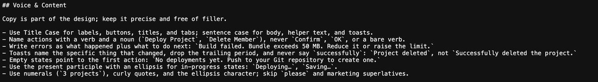
For button copy, it requires an action plus an object, like "Deploy project" or "Remove member." Not just vague words like "Deploy," "Confirm," or "Delete."
The reason is simple. When a user sees "Delete," they still need to figure out what's being deleted. With both action and object, the user immediately forms a complete understanding.
Error messages follow a similar pattern. Vercel's rule is clear: first tell the user what happened, then tell them what to do next.
For example, a build failure because the bundle exceeds the size limit: the solution is to reduce the bundle size or adjust the limit. In three sentences, the user knows exactly what went wrong and what to do next.
Many products show vague error messages like "Operation failed, please try again later," which carry almost zero information. The only thing the user learns is that it failed. Why it failed and what to do next remain a mystery.
The copy guidelines in a design system are essentially about reducing such guesswork.
Vercel also specifies success messages: just describe what changed. For example, "Project deleted," not "Project deleted successfully."
Because the fact that the confirmation dialog appeared proves the operation succeeded. "Successfully" is redundant.
另外,文案同样被当成 Vercel 设计规范的重要部分。这是大多数 DESIGN.md 里最容易缺失的。
Vercel 对这些细节却规定得非常具体。
比如按钮文案,要求必须是一个动作加一个对象。像部署项目、删除成员这样。不能只写部署、确定、删除这种模糊词。
原因很简单。看到删除的时候,用户还需要想一下到底是删除什么。有动作,有对象,用户立马就能够形成完整的理解。
报错信息也类似。Vercel 给出的规则很明确。先告诉用户发生了什么。再告诉用户接下来应该怎么办。
例如构建失败,原因是打包文件超过了大小限制,解决办法是缩减体积或者调整限制。三句话读完,用户立刻知道问题在哪里,也知道下一步该做什么。
很多产品里的报错提示是操作失败,请稍后重试。这样的提示信息量几乎为零。用户读完之后唯一获得的信息,就是失败了。至于为什么失败,接下来怎么办,依然需要自己猜。
设计系统里的文案规范,本质上是在减少这种猜测。
Vercel 也还规范了操作完成后的提示信息,只需要说明发生了什么变化。比如项目已删除,不能写项目删除成功。
因为提示框能够弹出来,本身就已经说明操作完成了。成功这两个字属于重复信息。
Next up is motion.
This part is particularly interesting because it goes against my intuition. I used to think that more animation makes a product more polished.
So button hover animations, menu pop-up animations — that seemed classy. Many Vibe Coding products seem to lean this way.
But Vercel's stance is entirely different. They even explicitly state that for many interactive scenarios, 0 milliseconds is often the best choice — meaning no animation, instant transitions.
If a button changing from default to hover state is already clear enough, the best feedback is instant. Adding an animation only makes the interface feel sluggish.
Of course, some scenarios do need motion.
For example, a dialog suddenly appearing without any transition can be disorienting — the user might not know where it came from. That's when animation adds value.
Vercel even specifies the duration for different scenarios: ~150ms for regular state changes, ~200ms for popups, ~300ms for modals.
The bigger the change, the longer the reaction time needed. The smaller the change, the more direct the feedback.
The underlying logic is always the same: don't animate unless necessary. And when you do, make it fast, lightweight, and restrained.
接下来是动效。
这一部分其实特别有意思,因为它和我的直觉刚好相反。我会觉得,动画越多,产品越精致。
所以,按钮悬停加一点动画,菜单弹出加一点动画,似乎这样才显得高级。现在好多 Vibe Coding 的产品似乎都朝着这样的方向发展。
但 Vercel 的态度完全不同。他们甚至明确写到,很多交互场景下,0 毫秒往往是最好的选择。也就是说,不加动画,瞬间完成。
如果一个按钮从默认状态变成悬停状态,这个变化已经足够清晰。那最好的反馈就是立刻发生,额外加一层动画,反而会让界面显得拖沓。
当然,有些场景确实需要动效。
比如一个弹窗突然出现。如果完全没有过渡,人会不知道它从哪里来的。这时候动画就有价值了。
Vercel 甚至把不同场景的时长都规定好了。普通状态变化大约 150 毫秒,弹出层大约 200 毫秒,模态框大约 300 毫秒。
变化越大,给人的反应时间越长。变化越小,反馈越直接。
背后的逻辑始终只有一个,能不动就不动,需要动的时候,也要快、轻、克制。
The last part that left a strong impression is accessibility.
Honestly, I rarely paid much attention to this before. Most of the time, as long as a product looks good and functions well, it seems enough. But Vercel writes about it very seriously.
They require sufficient contrast between text and background. State changes cannot rely on color alone; must also include icons or text labels.
All interactive elements must have clear focus states; don't remove them for visual cleanliness.
These rules mean the design system serves everyone, including people with color vision deficiency, those who navigate with keyboards, and those viewing on a phone in bright sunlight.
This DESIGN.md is incredibly professional. I think anyone creating a new product should write their own DESIGN.md based on the thinking in these two files.